From Hubspot Marketing December 25, 2013
Merry Christmas.
We have about P50 million increase in sales that we must wrestle through in 2013. We have discussed with MC some of the strategies:
1. Fortifying the agencies : increase in recruitment, training, motivating and selling + 10 million
2. New products: garden lots, chapel services, ete, PMS, CAF, cremation + 10 million
3. Bundling: old product + new product, old product plus new service. + 20 million
4. New marketing - email marketing + 10 million.
This will be done at 3ffb and closing will be farmed out to the SBU. Our methodology now is the DSM but we will use science and internet by: doing the LCP, and autoresponders, automating the email and newslettter templates
The Landing Capture Page
Pageviews, leads can considereably increase through captivating, irrestible landing capture pages. that are magnets to prospects, visitors to leave their emails. Most page visitors will not visit the site unless they are compelled to bookmark or leave email addressess. The objective of the landing page is to capture that information: prospects email or name so that more communication can be sent to him. The LCP reenforces the permission/opt in marketing. You cant do anymore outbound marketing because that is spamming
Hubspot defines landing page as:
7 principles of Landing Capture Page Design
As we have said the LCP must capture the prospects/emails must be funneled as leads. Thus it has to be compelling and irresistible not to leave the email to the advertiser, at the site.
The elements of a good design of LCP are:
Design elements:
1. Encapsulation'
2. Contrast and color
3. Directional cues
4. White space
Psychological elements
5. Urgency and scarcity
6. Try before you buy
7. Social proof
The rest of the article:
) Encapsulation
This is a classic technique used to hijack your visitors' eyes and create a tunnel vision effect. You can think of it like creating a window on your landing page where your call-to-action (CTA) is the view. Here, a circular arch creates a frame for the feature in the distance, preventing your eye from wandering elsewhere in the photo.
Landing Page Tip
Use strong dynamic shapes to constrain your points of interest. Think of the classic James Bond intro sequence where you see him inside a circular design. The second example above shows how your eyes are immediately driven to the end of the tunnel. This example also uses elements of contrast and directional cues.2) Contrast and Color
Using contrast is a fairly simple concept that applies across the color spectrum, but is most easily viewed in monochrome.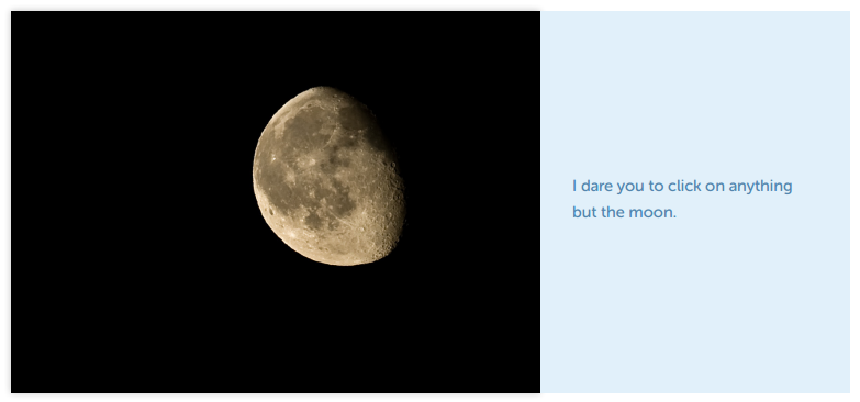
Landing Page Tip
The more you can make your call-to-action stand out from its surroundings, the easier it will be to see. If you have a lot of black/grey text on a white background, then a black or white CTA won’t provide the desired contrast, and you’d be better off with a colorful element. But if you have a very clean design without much detail or copy, a big black or white button can be dramatic.Color can be used to create an emotional response from your visitors. Orange, for example, is known to generate positive feelings and can be a great choice for the color of your CTA. The psychological impact of color in design is noted in the following list.
- Red: danger, stop, negative, excitement, hot
- Dark Blue: stable, calming, trustworthy, mature
- Light Blue: youthful, masculine, cool
- Green: growth, positive, organic, go, comforting
- White: pure, clean, honest
- Black: serious, heavy, death
- Gray: integrity, neutral, cool, mature
- Brown: wholesome, organic, unpretentious
- Yellow: emotional, positive, caution
- Gold: conservative, stable, elegant
- Orange: emotional, positive, organic
- Purple: youthful, contemporary, royal
- Pink: youthful, feminine, warm
- Pastels: youthful, soft, feminine, sensitive
- Metallics: elegant, lasting, wealthy
In our first conceptual example, an in-your-face approach is used. The color is so overwhelming you can’t help but stare at it. In the second example, position and color contrast are used to move your eye toward the grasshopper. The reason this works is the entire image is a limited color palette except for the subject of interest.
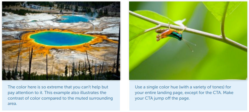
Landing Page Tip
Let your primary conversion target dominate the page.3) Directional Cues
Directional cues are visual indicators that point to the focal area of your landing pages. They help to guide your visitors toward what you desire them to do, making the purpose of your page as soon as they arrive. Types of directional cues include arrows, pathways, and the directional impact of line of sight.Arrows
As directional cues, arrows are about as subtle as a punch in the face, which is why they work so well. With so little time on your page, visually guiding the user to the intended focal point is a smart move. Arrows let you say, “Ignore everything else, and pay attention to this please.”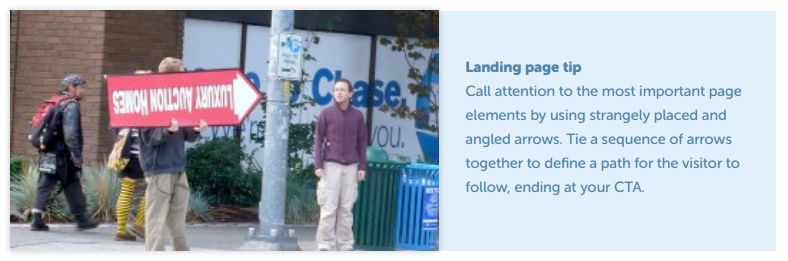
The awesome example above shows three types of cues at once. The arrow is a directional pointer, the man opposite is then firing you right back to the guy with the arrow using his eyes, and finally the upside-down text acts as an interruption that makes you stop and stare, and most likely rotate your head to figure out what it says.
Pathways
Pathways are representations of real-world way-finding avenues that trigger our brains into thinking we need to follow them. This example shows a long straight road, leading your eye to the large rock formation at the top of the photo. Roads are so strongly ingrained in our psyche as the path of least resistance, that we naturally gravitate toward them as a transport guide.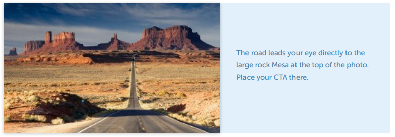
Landing Page Tip
Design converging lines to draw people to your call-to-action. Triangles are the most dynamic of all shapes, and their natural tendency to point make them a special design tool, in the same way that an arrow is a more intricately designed pathway.The Suggestive Power of the Eye
As humans, we’re all programmed to understand the purpose and use of eyes, and the meaning that comes from the eyes of someone or something else. Look at the following examples to see how it works.In the first example below, the capuchin is looking at the banana very intently. Curiosity is the motivation that forces you to follow his gaze.
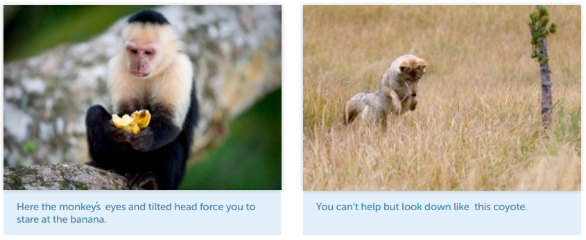
With eye movement comes head movement. In the second example above, you're not only curious about what could be in the grass, but you also instinctively look down with the coyote. You’d want your conversion target to be where he, and everyone else, is looking.
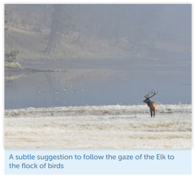
In the third example below, the directional cue is more subtle, but still very clear. Your attention is first driven to the elk in the bottom-right corner. This would be your primary headline or unique selling proposition. You then follow his gaze to the left to see what he’s looking at -- arriving at the flock of birds flying over the river -- which would be your CTA.
Images of Babies and Attractive People
An important aspect of design is imagery. It can create a strong connection between you and the photo, and therefore, the page. When it comes to the types of effective human images to use, babies and attractive people are well known to have an impact. Of the two, the most universal in persuasion are babies. The research suggests we are all wired to react to a baby’s face.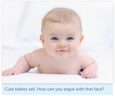
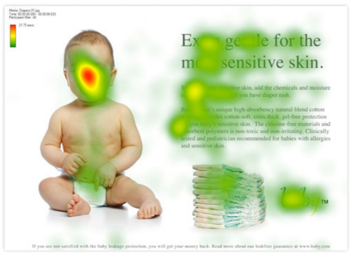
In an eye tracking heat map study from UsableWorld, a baby was used to see what effect it would have on visitor attention. The first example shows how much attention is driven toward the baby’s face:
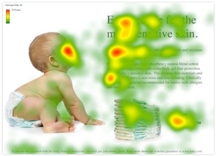
In the second example, the power of suggestion is shown in full effect, as the baby still gets lots of attention, but the area he is looking at receives a lot more than in the first example:
Attractive women have also proven to be a persuasive human element on a landing page. The next example is about the effect caused by a powerful personal connection, where the eyes of your subject mesmerize you into paying attention. This, like the eye contact illustrated in the first example, is a good way to increase a visitor's time on page, providing valuable extra seconds for your value proposition to sink in.

4) White Space
White space (or blank space), is an area of emptiness surrounding an area of importance. The reason we say blank space is because the color of the space isn’t important. The purpose is to use simple spatial positioning to allow your call-to-action to stand out from its surroundings and give your eye only one thing to focus on.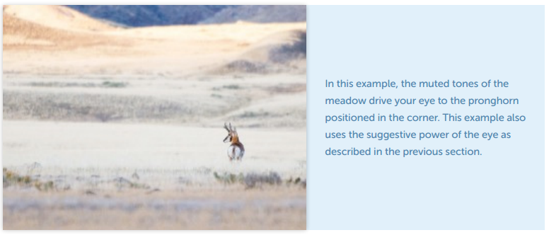
Landing Page Tip
Give your page elements breathing room to produce a calming effect and allow your CTA to stand out from the rest of your design.5) Urgency and Scarcity
Common psychological motivators are the use of urgency (limited time) and scarcity (limited supply). They’re simple concepts that can be applied in a number of ways.Urgency
"Buy now." "Don’t miss out." We’re used to hearing these types of phrases. Statements of urgency are used to coerce us into making a purchasing decision right away. Amazon and Ticketmaster, for example, use this technique very effectively.Amazon: Order Before Date
Most people are familiar with this one. Amazon is largely responsible for a number of pressure point triggers, one being the “order before” concept. This relies on using a finite period of time remaining to encourage an immediate purchase decision. Initially used to guarantee delivery for Christmas if you ordered by a defined date, Amazon has extended the strategy to cover everyday use cases. This makes it applicable for people’s birthdays, which can occur on any day of the year.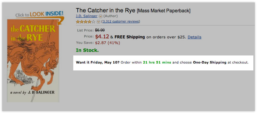
Ticketmaster: 4 Minutes Left to Buy Your Ticket
Ticketmaster has also found a way to increase the urgency of buying tickets. Once you’ve selected your seats, you only have a few minutes to complete your transaction before your opportunity expires, and someone else can swipe your tickets. You can see this time in the bottom-right corner of the screenshot below.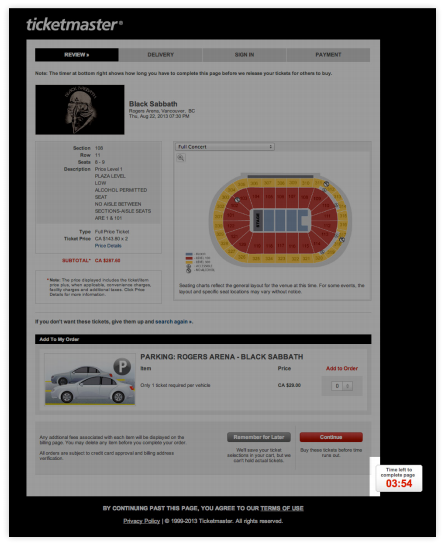
Scarcity
To use the concept of scarcity, you need to convince someone they need to buy right now, before supplies run out. This increases the fear of missing out on the desired opportunity.Expedia: X Seats Left
Airline ticket purchasing is very sensitive to the concept of scarcity, because the number of seats rapidly diminishes as the flight time nears. To leverage this, Expedia uses transparency as a psychological trigger to encourage you to get your credit card out and book right away. They do this by showing the number of seats left on the flight, but only when the number is low, like only three seats left, as shown in this example:
6) Try Before You Buy
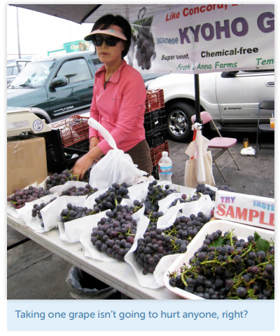
One of the most common real-world examples of 'Try Before You Buy' is when people sneak a quick taste from a bunch of grapes in the supermarket. We’ve all done it. It seems to have become an internationally recognized form of acceptable thievery, although some feel guiltier about it than others.As a conversion-centered marketer, you can learn from this by allowing your visitors to taste your wares without fear of recrimination.
In the example shown below, this grape vendor has gone the extra mile to provide a section devoted specifically to grape samples, showing the confidence of someone who has a quality product.
The Preview
If at all possible, give people a preview of what you’re selling. Giving away an ebook in exchange for personal data? Provide chapter one as a free PDF on your landing page. Or, excerpt a chapter and use it as a blog post, whose CTA is the full ebook download (just like we're doing here!). Some people will decide they don’t want your product, but it’s better to separate the wheat from the chaff immediately instead of gathering 500 meaningless leads from unqualified prospects.Amazon is a classic example of this principle with its 'Look Inside' feature, which lets you read a portion of the book in advance.
In Transparency We Trust
By opening your product to scrutiny before the purchase, you appear authoritative and credible. This increases trust, and it can be an important factor in boosting conversions.7) Social Proof
Social proof is created by the statistics and actions of a particular crowd, and it can greatly enhance the “me too” factor. The major benefit is a level of authentic believability. In the photo below, the line outside the store makes you believe something important is going on, even if you don’t know what it is.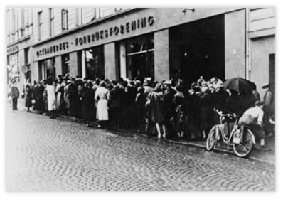
Landing Page Tip:
Similarly, you can provide the sense something is happening on your landing page. By showing the number of social shares, webinar registrants, or ebook downloads to date, you might leverage a few extra seconds of attention to impress your message upon a visitor. Testimonials can also be a strong factor in creating a sense of trust, especially if they come from people in the same type of business as your prospect, where the name of the company is known to your target audience.Having said that, testimonials can hinder conversion rates if used incorrectly. You can read more about poor use of testimonials in “Why Your Customer Testimonials Are NOT Working.”
The Man Looking Skyward Experiment
In 1969, a study was performed on the streets of New York City in which a man was standing looking up in the air. The study showed people would walk past him and not pay attention to what he was looking at. However, when the number of staring people increased to five, people started reacting by joining in and looking up to see what was going on. Increasing the participants to 18 people resulted in a 400% lift of people joining the crowd. Clearly, the bigger the crowd, the bigger the crowd gets.This is an adapted excerpt from the free ebook, Conversion-Centered Design: Essential Elements of High Converting Landing Pages, written by Unbounce Co-Founder and Creative Director Oli Gardner. He is a former interaction designer who tends to use metaphor more than he probably should in his writing. Oli writes about conversion-centered design (a term he coined), marketing, and landing page optimization. You can follow him on Twitter @oligardner. Download the complete ebook to learn more about how to beat the average and use design to help increase your landing page conversion rates.

No comments:
Post a Comment
1. One of our beliefs is learning. It pays that you learn more to do more Just to survive you have to learn how forage in a forest or raise your food, catch prey
2. In order to discharge your job well, you have to learn your admin plan the process flow and standards.
3. To keep up with changes, you have to learn and read. There is no other way
4. signify that you have read by putting your name on this comment box. Every staff must: post the name on this comment box, or like, agree/will do. Your registering on this comment box is being graded under communication. Observe RRURAC: Read, Reflect, Understand, Realize (apply to reality) Apply, and Check (if it works)
You need to make __comments a month to qualify for promotion under our CCD
Read the posts on this site every AM talk. Many problems arise simply because people do not know what to do, because they did not read this site
We are making sure that you improve yourself, engage yourself in self improvement through this site...
Note: Only a member of this blog may post a comment.